

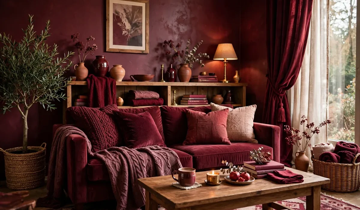
There is something unmistakably inviting about deep red. It is the color of ripe cherries, aged wine, and autumn leaves at their peak. In home decor, deep red sits in a sweet spot between bold and timeless. It is richer than bright red, warmer than brown, and more dramatic than neutral beige. Used well, it makes a room feel cozy, elegant, and alive, without ever feeling loud. If you want more warmth at home, burgundy and wine-toned decor is one of the most rewarding directions to take. Deep red works in living rooms, bedrooms, dining rooms, and even small entryways. It pairs beautifully with natural wood, brass, cream, forest green, and charcoal. Best of all, you do not need a full renovation to enjoy it. A few thoughtful changes, from cushions and throws to a single painted accent wall, can completely change how a room feels.
Why Deep Red Works So Well at Home
Warm and Sophisticated at Once
Many warm colors feel cheerful but a little casual. Many dark colors feel elegant but a little cold. Deep red manages to be both warm and sophisticated. Burgundy has a brownish, wine-like undertone that keeps it grounded, while its red base keeps it full of energy. That is why it shows up in libraries, boutique hotels, and cozy restaurants. Deep red also has a wonderful effect on light. In daylight, it glows richly and makes wood tones look warmer. In the evening, under soft lamps, it becomes moody and intimate, perfect for relaxing or gathering with family.
Surprisingly Easy to Live With
Bright, fire-engine red can feel intense in large amounts. Deep red is different. Because it is darker and more muted, it behaves almost like a neutral, similar to navy or forest green. You can use it on a sofa, curtains, or an accent wall without the room feeling overpowering. It also hides everyday wear better than pale colors, and it works across seasons. In fall and winter it feels festive and cozy. In spring and summer, paired with cream and fresh greenery, it feels rich rather than heavy.
Choosing the Right Shade
Not all deep reds are the same, and the undertone shapes the whole mood of a room.
Burgundy and Wine
Burgundy leans slightly purple, like a glass of red wine. It is elegant and slightly formal, and beautiful in dining rooms, bedrooms, and reading corners. Wine tones pair especially well with brass, dark wood, and cream.
Oxblood and Brick Red
Oxblood is a darker, brownish red that feels almost like leather, wonderful for accent chairs and study areas. Brick red is a touch lighter and more earthy, with a warm clay feeling. It suits farmhouse, rustic, and Mediterranean inspired homes.
Raspberry and Cherry
Raspberry red has a hint of pink and feels a little livelier. Cherry red is brighter and fresher. These shades are great for smaller accents, such as vases, artwork, or a single statement cushion. Before you buy paint or fabric, test shades in your own light. Paint a swatch on cardboard, move it around the room, and look at it in both daylight and lamplight.
Where to Use Deep Red
The Accent Wall
For a dramatic change with minimal effort, paint one deep red accent wall behind your sofa, bed, or fireplace. The rest of the room stays light, so the space still feels open, while the red wall adds depth and a natural focal point. In a bedroom, a burgundy wall behind the headboard creates a cozy, hotel-like feeling.
Textiles: Cushions, Throws, and Curtains
Textiles are the easiest way to try deep red. Start with two or three cushion covers in different textures, such as velvet, linen, and chunky knit. Add a soft throw over a sofa or at the foot of a bed. Floor-length curtains in a deep wine tone can make a room feel instantly warmer. The beauty of textiles is that you can change them with the seasons.
Furniture and Statement Pieces
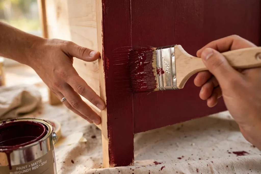
A single deep red piece of furniture can anchor a room: a velvet accent chair, a tufted ottoman, or a painted side table. Because deep red is so rich, one statement piece is often enough. If you enjoy DIY, painting a thrifted dresser or stool in burgundy, with new brass or matte black hardware, is a satisfying weekend project.
Small Accents
Small accents can tie a room together. Try burgundy candles, a wine-toned vase with dried flowers, a deep red tray, or burgundy napkins on the dining table. The key is repetition. When the same shade appears in three or four places, it looks intentional rather than random.
Colors That Pair With Deep Red
Cream and warm white keep the room bright and let red stand out. Natural wood and brass make deep red feel richer. Forest green and olive are natural partners, since they appear together in nature all autumn. Charcoal and black create a modern, moody look, while blush pink gives a softer, romantic feel.
Easy Deep Red DIY Projects
You do not need to be an experienced crafter to bring deep red home. Paint a small stool or picture frame in burgundy and finish it with a clear protective coat. Make no-sew cushion covers by wrapping burgundy fabric around a cushion insert and tying the corners with ribbon. Group candles of different heights in deep red, burgundy, and cream on a wooden tray for a simple display. Or refresh a grapevine wreath with burgundy ribbon, dried red berries, and deep red fabric flowers for instant seasonal warmth.
Styling Room by Room
In the living room, aim for balance. If your sofa is neutral, add deep red cushions, a throw, and one piece of artwork. In the bedroom, keep it restful: a burgundy throw over cream sheets, or burgundy curtains with soft lighting. The dining room is one of the best places for deep red, because it feels festive. Try burgundy napkins, a wine-toned runner, and candles. Even a small entryway can handle a burgundy console table or a deep red rug for a welcoming first impression.
Common Mistakes to Avoid
Avoid using too many different reds at once. Pick one main shade and repeat it. Avoid pairing deep red with too much black in a small, poorly lit room. And be careful with shiny, cheap-looking red fabrics. Matte velvet, linen, cotton, and wool look far more expensive than glossy polyester. Deep red absorbs light, so make sure the room has enough lamps, natural light, or lighter surfaces to balance it.
Frequently Asked Questions
Is deep red too dark for a small room?
Not necessarily. Used on one accent wall or in textiles rather than on every surface, it can make a small room feel cozy and intentional. Pair it with light walls, good lighting, and a mirror to keep the space open.
What is the difference between burgundy and wine?
Burgundy tends to lean slightly more purple and brown, while wine can be a touch brighter and redder. In home decor the terms are often used interchangeably, so focus on the actual shade rather than the name.
Does deep red go with gray?
Yes, it pairs beautifully with warm gray and charcoal. Cool, bluish gray can sometimes clash, so choose a warm gray with a slight beige undertone.
How can I try deep red without painting?
Start with textiles and small accents: cushion covers, a throw, candles, napkins, and artwork. If you love the color after a few weeks, move on to curtains or a painted piece of furniture.
Is deep red only for fall and winter?
No. In fall and winter it feels cozy and festive. In spring and summer, pair it with cream, fresh greenery, and lighter textures so it feels rich rather than heavy.
Final Thoughts
Deep red is one of those rare colors that feels both bold and easy to live with. It brings warmth, depth, and quiet luxury to any room, and it works with almost every style. Start small with cushions, candles, or a painted stool, see how the color feels in your light, and build from there. Pick one room, choose your favorite shade of deep red, and start with a single accent this weekend. You might be surprised how much warmer your home feels with just one rich, wine-toned touch.